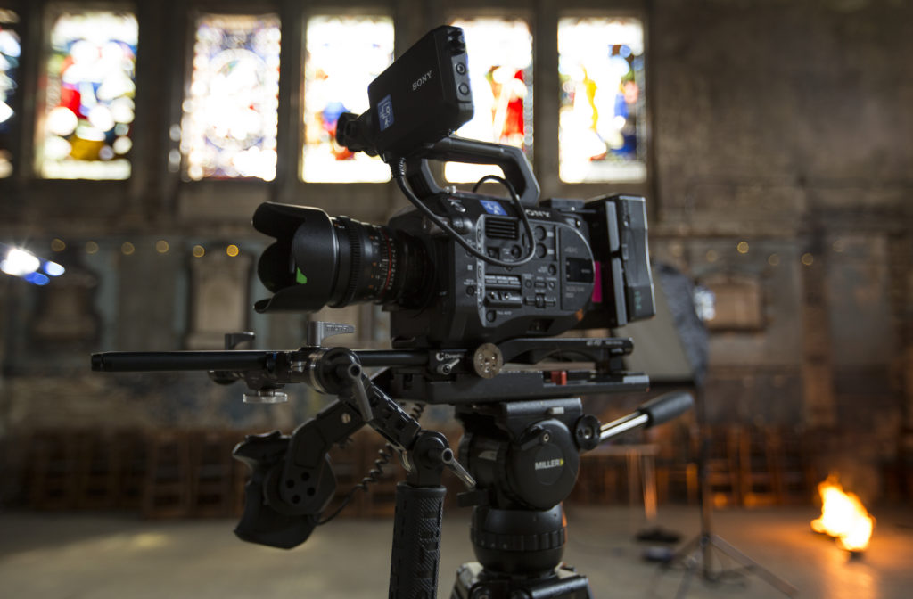
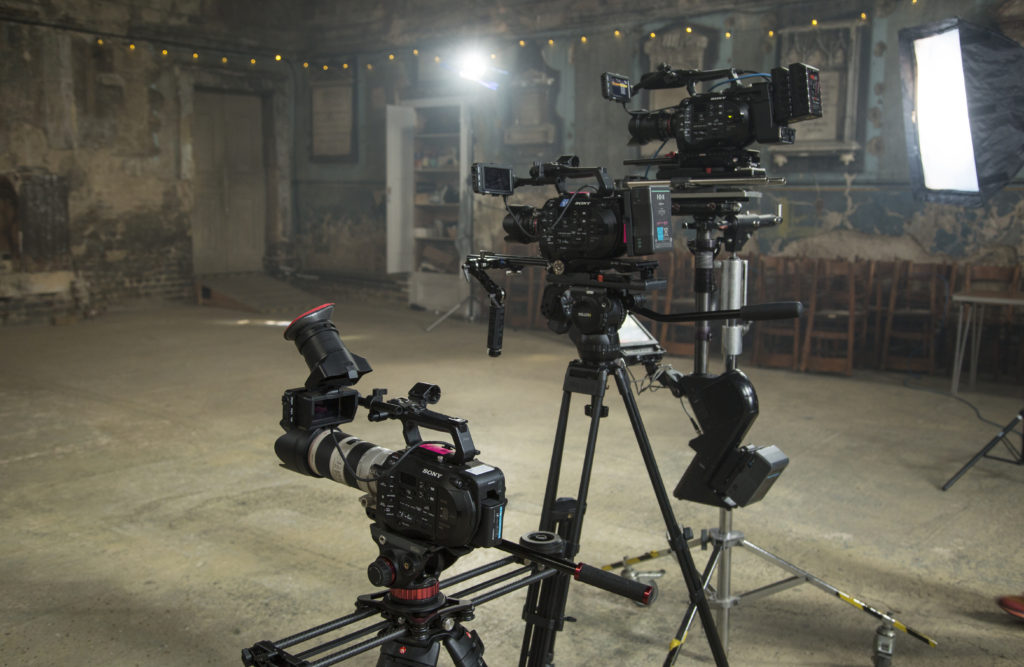
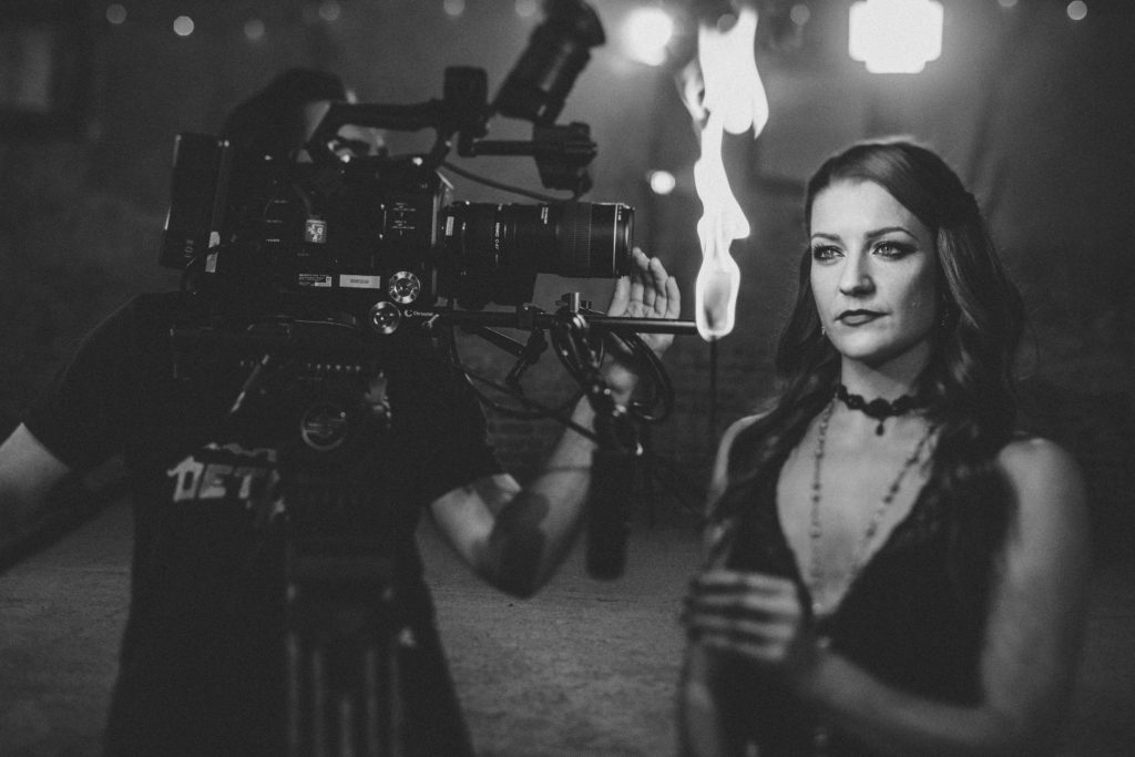
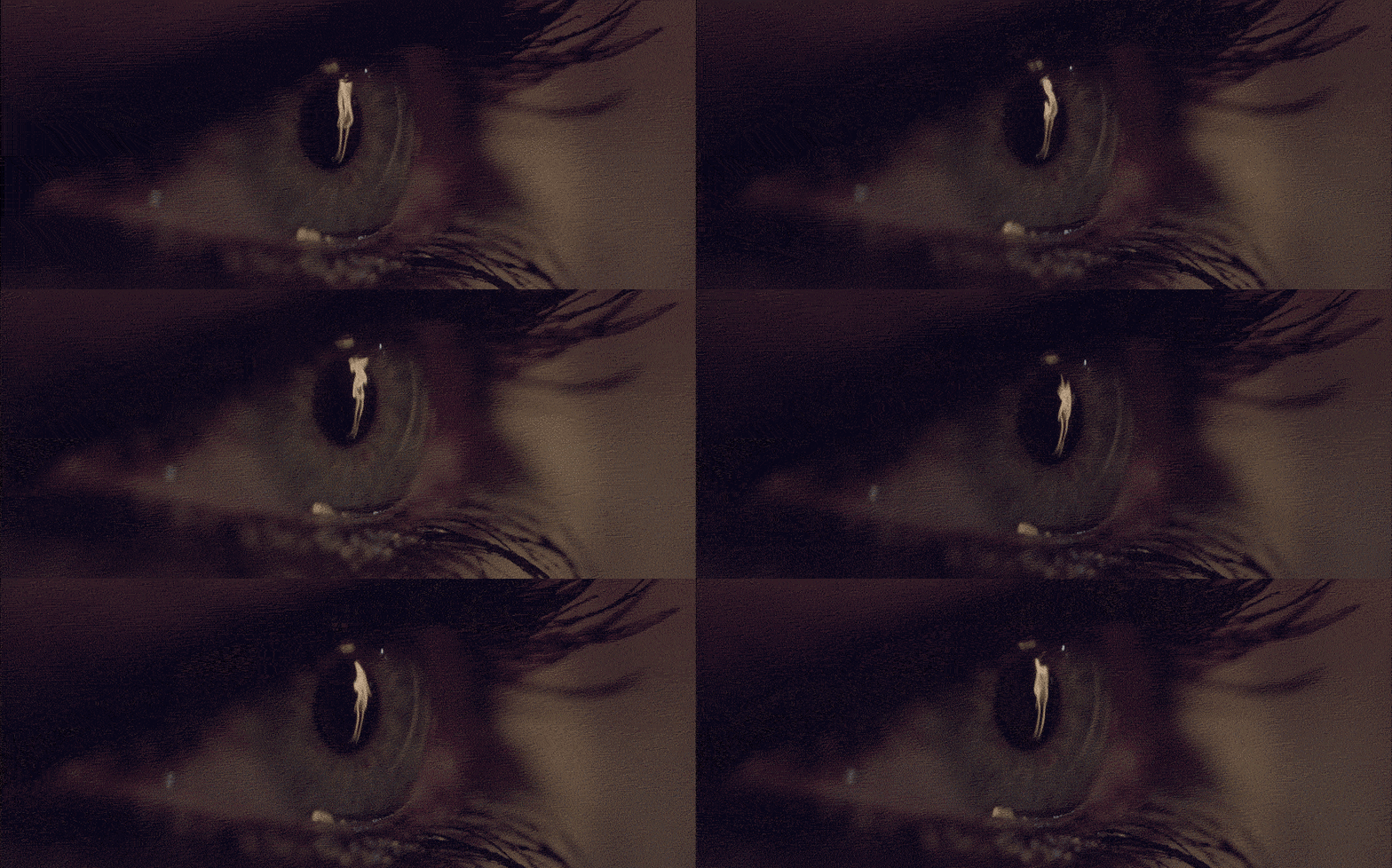
Back in 2016 we had produced a number of collaborative/side projects (see Joel Tarr, Funke and the Two Tone Baby). The final side project was a promotional montage for fire and pyrotechnic specialist performer, Naomi French.

I first met Naomi back in 2014 working on ‘The Gadget Show Live’. I was one of the live camera operators and she was hired to choreograph and perform the big opener to the show. Naomi’s other credits include ‘Top Gear Live‘, ‘The Voice UK’, ‘Strictly Come Dancing’ and performing on stage with ‘Fall Out Boy‘.

When the opportunity arose to test out our PXW-FS7 cameras, Naomi was one of the first people I contacted. I wanted to produce a bespoke video that would showcase her talent in one go as opposed to her previous reel, which was decent, but comprised of bits of footage from various events much like our own reel.  It’d also give us a chance to push our cameras to the limit and test their capability in low and high light simultaneously.  Having not shot fire to this extent before, the process was a huge learning curve.

Pre-Production

Finding the right venue was a struggle. I knew I wanted something dark and rugged, but having discussed themes with Naomi, we settled on a kind of religious, gothic look and the search soon changed from abandoned warehouses to churches and chapels.

Eventually I happened upon Caroline Gardens Chapel. Now managed by Maverick Projects, the chapel stands in the middle of a terraced residential area in Peckham, South East London. It was bombed during WWII and if you look closely during some of the wider tilts, the roof was rebuilt and replaced, so it actually looks a bit like a set.

I met with Naomi a week ahead of the shoot (this was all very last minute) to recce the venue and think about the ‘props’ (the term used to refer to an individual trick or ‘move’) that we wanted to showcase, and how we could shoot them. We had discussed a narrative arc but ended up favouring a more music led montage. Ultimately this was a promotional video for her and a test for us.

The Shoot

The crew (and equipment) was entirely made up of our in-house team, with the exception of Nathan Claridge, who is one of our go-to Steadicam operators. Nathan worked with us both on Gadget Show Live, and was keen to work with Naomi again. You can find his website here.

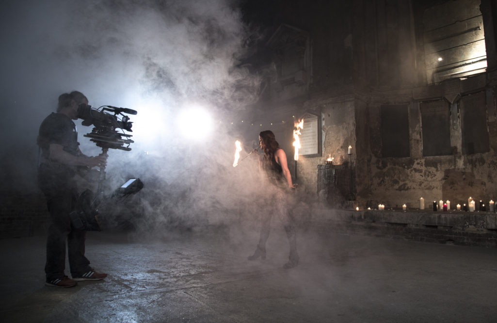
The venue gave us from 1.30pm until 9.30pm, which is a fairly tight day when you put into consideration the amount of set up time you need for lighting, set dressing, camera prep and so on.  As it was a no budget piece, we only had about 7 people on set, including Naomi and her assistant, Rachel. By the time we’d started filming it was nearly 5pm.

On set, Naomi performed to a track on a mini stereo so that she could establish a consistent tempo/pace to move to, then each prop was filmed once or twice with two cameras. Nathan’s Steadicam camera (the sweeping wide shot), was set at 4K, 50fps, and my camera was set at HD and varied from standard 25fps to 150fps, depending on the prop. The FS7 will only allow you to record in 4K up to 60fps and in HD up to 150fps internally. But knowing we were outputting in HD, I wanted the ability to crop in to the 4K image and to get some really beautiful streaming flames in slow motion.

The biggest issue with fire is exposure (Sherice will touch upon this in the section about colour grading below). While we’ve ended up with a rather beautiful piece of work in the end, getting the lighting right was tough. Ideally in this situation you would pump a lot of light into the room and stop down in camera, but we didn’t have a lot of lighting with us and the flames themselves (particularly in the bigger props) cast a lot of light. It would have been great to have taken a light metre reading before each prop, but fuel is very expensive and we could only afford to do each prop a number of times – there were no rehearsals.

We ended up using a single 2K blonde tungsten lamp with diffusion as a key light, a 650w fresnel as a fill, 2x LED panels and 1x dedo as backlights, 2x dedos to fill the back wall and 1x extra 2K blond creating a streak in the space behind the rear wall (the chapel entrance). It sounds like a lot, but for lighting a large space like this it’s not ideal.

Each prop would also cast a different colour, depending on the heat that’s produced, the type of fuel and the size of the flames. So while we changed the ‘base’ lighting set up very little, each prop completely changed the look of the surrounding area and Naomi’s skin tones.

Thankfully the FS7s were incredibly forgiving for a camera in its price range, and we were able to pull back a lot of data that would have been lost to shadows or over exposure, had we been not been shooting in log mode.

To make things harder, the light would change throughout the day and for various reasons, we were unable to black out all of the windows so that we could keep the light consistent. Thankfully, as this was a montage piece, changing light wasn’t an issue so long as it was consistent within the given scene. On a paying project, we’d have been able to control the light much more effectively.

Photo credit: Wojtek Chrapek, https://www.instagram.com/voyteckphoto/

Photo credit: Wojtek Chrapek, https://www.instagram.com/voyteckphoto/

Post-Production

Having to weave this project around others meant that post-production on this one didn’t start until quite late in the year. Once the edit was assembled into the best stuff, I sat down with Naomi and worked the edit to her desired track. I’d done an initial colour grade, but we decided that the track was so epic that the whole piece needed to be a lot darker to reflect the mood of the music.

Enter my new side-kick, Sherice. I wanted to start her off here at No Magnolia with something a bit fun and immediately threw her In at the deep-end with this project. She’d done some grading in Da Vinci Resolve before but was keen on spending some time learning more about the software. This was a bit different to your typical grade, and required some extra care and attention. We put her to work and after no time at all she was negotiating the software faster than anyone could have hoped for.  See her write up on her experiences below.

Colour Grading Naomi in Da Vinci Resolve

By Sherice

Being a relatively new colourist who is still learning the more advanced techniques of Da Vinci Resolve 12.5, the challenge of grading a video with so much fire was quite daunting. The footage was exciting and very fast paced which meant that I wanted to ensure the grade matched not only the intense performance but also the dark and epic soundtrack of the video.

The first thing I do with any colour grade is to balance the luminance and try to make a project consistent throughout. The first challenge I faced was trying to ‘normalize’ the video. One half of the video was shot and lit with tungsten lamps and LED panels as well as the fire, but with a great deal of external light still coming in through the windows. As the sun set and the natural light disappeared, some of the more epic props were lit by lamps and flames alone, creating an entirely different look. As Neil mentioned earlier, in an ideal situation we would have blacked out windows to create consistent light throughout.

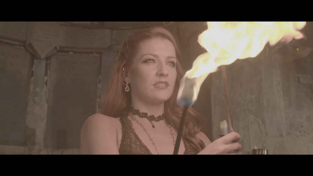
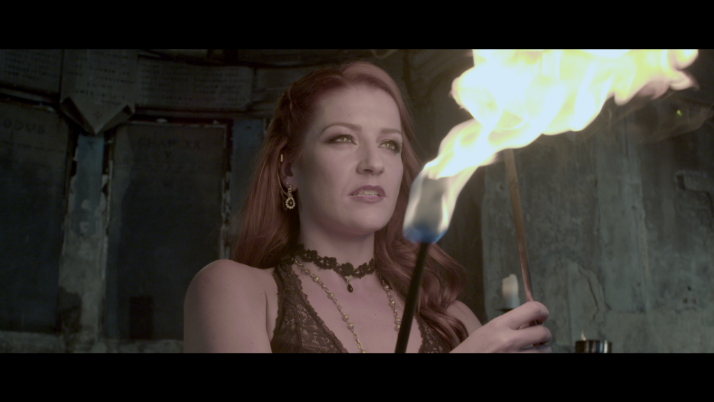
The above image shows the raw file that was ingested into Da Vinci before I applied the initial grade

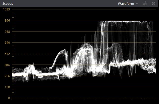
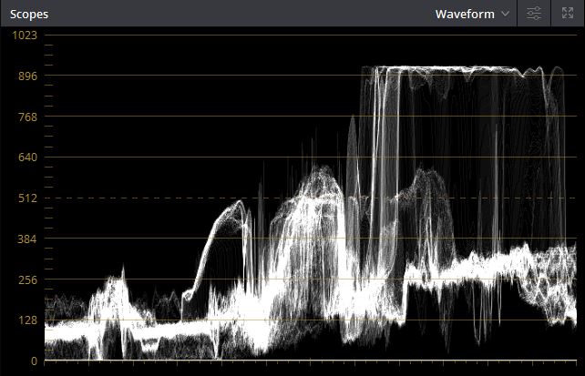
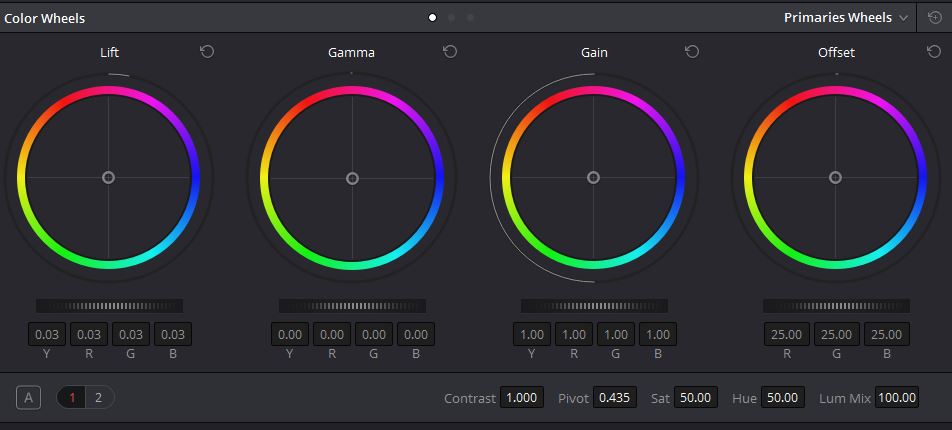
To determine the luminance of the image I initially set the highlights to 1023, but later brought them down to just above 896. The reason for this was just to avoid clipping out some of the details in the highlights of the image. I also set the blacks to 0 and used this to ensure the images were set to the same parameters.

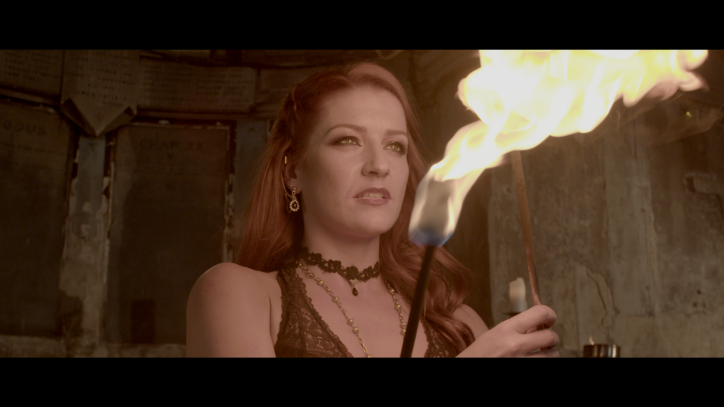
After doing a rough luminance balance I began to look deeper into the video colours. There were some lovely contrasting colours in the first half of the video and I pulled the shadows into a blue/green to compliment the orange and intensity of the fire. As seen with the below image of the final grade.

As Naomi was lit mostly by the fire sometimes I had to bring the saturation on her skin down just to repel some of the reds and magentas that were created by the fire.

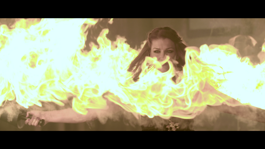
Drag the slider to see the shot before and after the grade.


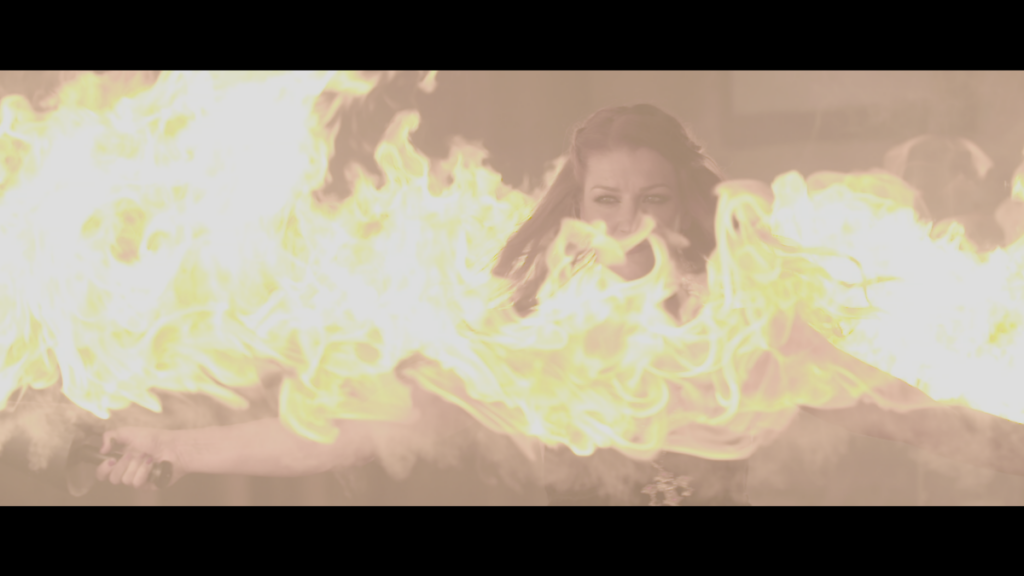
However this was not a quick fix for the whole video, there were still a lot of minor corrections throughout and the final minute of the video was lit in an entirely different way, largely by the huge bursts of flames you see below.

As you can imagine, lighting someone almost entirely by fire means firstly very high contrast, lots of shadows in the background and also a lack of any other colour apart from orange! As the flames were so aggressive on exposure, the camera operators had to expose accordingly and therefore lost any detail in the shadows that were initially saved by the lamps on set.

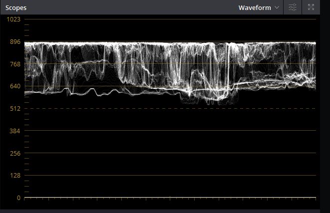
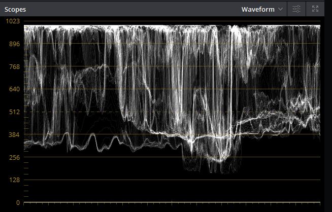
After trying to match this part of the video with the initial grade I found that it was nearly impossible to bring back the colours that were lost. The waveform was so heavily compressed it meant that there just wasn’t the detail to pull back.

As you can see from the above waveform the blacks were around 512, the highlights were 896, which is where we set the highlights from the earlier shots.

I originally tried to pull the blacks down to 0 but the contrast became too high and we lost a lot of detail in the mid tones as a result.

I decided that for the last section of the video we should embrace the slightly different look as it was almost an entirely different beast altogether.

I did a new luminance balance on the last few shots to lift the black enough not to lose details and put the highlights up to just below 1023.

Balancing the Colours

I then began my favourite part of the colour grading process, colouring the shots! As I mentioned I went for quite a cool background to contrast the warmth of the fire. Essentially this involved pushing the shadows towards cooler tones and just lifting the warmer tones to orange.

I think overall fire is quite a challenging thing to colour grade and even in big blockbuster movies keeping fire consistent is not always easy (watch the fire torches closely in ‘Pirates of the Caribbean’ and you’ll see inconsistency between reverse shots, for example). What I learnt from this project is that embracing the differences can be the best way to tackle the challenge and treating each clip as a standalone ‘scene’ is a great way to ensure your image is looking its best.